Last week I witnessed the well-known marketing guru, Seth Godin, paint pictures with a thousand words. And yet, Seth’s PowerPoint slides had zero text. None. Every slide consisted of a single picture illustrating the words he spoke rather than read. The story was in the pictures. Each slide created its own message, imagery, and metaphor. His style was direct, funny, engaging, and captivating. Text did not clutter the mind or the slides. As an audience, we were free to see the power of his message instead of PowerPoint. The points were made with pictures not PowerPoint. This style allowed us to listen rather than read.
The live presentation got me thinking about text. We often use too much. It’s easy to write text-filled landing pages or fill PowerPoint slides with too much text–text that serves as speaking notes rather than pictures that paint the story. Reducing text also encourages direct eye contact with your audience as you tell the story. You connect with the audience and the audience connects with you. Paint the picture. Engage. Allow them to experience, not “endure” your message.
So the next time you present, make your choice:
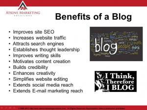
This?:

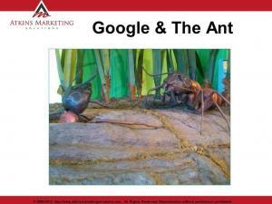
Or This:?
 Now, go paint that picture…
By Stuart Atkins


Leave a Reply