I’ve discovered a new tool: Heat Maps and Scroll Maps. I’ve known about heat maps and scroll maps but never applied them to my website. I thus signed up for a heat map service called “Crazy Egg.” In sum, Crazy Egg tracks every exact click and scroll on the chosen pages of my website. It tells me, like a digital breadcrumb trail, where visitors click and where their eyes track. The eye follows the click. The benefits of heat & scroll maps for websites are significant. Such tracking goes beyond Google Analytics. It tells you actual usability patterns and usage for your website. It tells you where people go and don’t go on your site. This is gold.
Heat Maps Rock
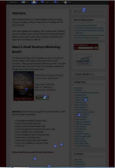
Below is a recent heat map (dark on purpose for contrast) This shows where users click each day to navigate my website. It’s preliminary, so as more clicks come in I will see even more patterns and usability movements from my site heat maps that monitor each page designate for tracking. I’ve already made some changes to my site based on just the first few days of data:
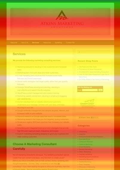
 Below is a scroll map. The yellow shows that most visitors, first, view the top 25% of my website and then scroll down, secondly, just below that. The top 25% thus needs to be the compelling content. Also, as more data comes in, I can act on this, too:
 So what can you take home from this? First, the top 25% of your website is the most important. Internet visitors skim, they don’t read. Don’t fill your site with tons of text and content. Get to the point and keep it simple, value-oriented, and clutter-free. You don’t need amazing design and a work of art to make a good website. Ignore pretty; think functional and usable. You need your value proposition in the first two sentences so visitors know immediately how you can benefit them. If you miss this you miss it all.
Go to www.crazyegg.com to see what this fantastic service can do for your website.
By Stuart Atkins


Leave a Reply